So micro.blog has a new icon (apologies for the Twitter link), which looks good if rather pumpkin-spicey on the Mac desktop. But then on iOS they put it on a sterile IVE-1138 white background which is eye-searing gold/white or maybe blue/black. I can't tolerate more of that, and Manton won't listen to reason.
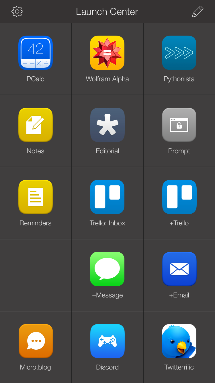
Well, I was living in filth anyway with a Springboard full of random crap, so I cleaned up with Launch Center Pro and a few folders for tools I use all the time, everything else is still in folders on pages 2-3. The custom icons are still a work in progress, I'm just using the cheesy prefab icons in LCP, but at least they're consistent.
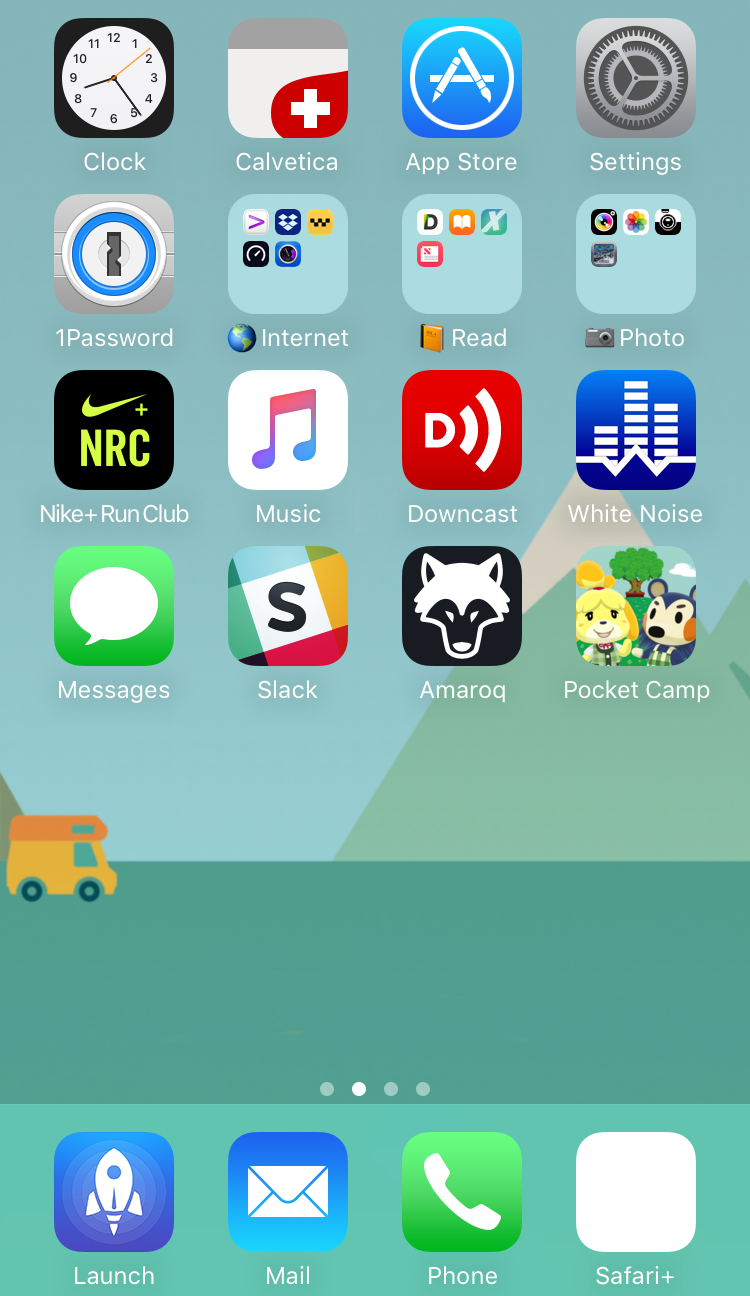
So now I have this:
|  |
Music app is still ugly, but I need it. The "Safari+" icon is just an about:blank page saved to Springboard, so when I tap that I get a new browser page; I don't think it can be recolored easily. Again, ugly but it's the only one of its kind. Mail's upside-down gradient is embarrassing, how does Apple not see that and FIX IT?! Light should be coming from the top left in all UIs, that was decided on NeXTstep 30 years ago!
If we could have transparent icons, or place icons freely, I could move the chat apps to the bottom, but currently you need a single-color opaque background for icons. Why does Tim Cook's Apple so hate fun and beauty, and let "Sir Jony Ive" (I didn't vote for his tragically un-beheaded "Queen", and a man who would bow to a monarch is no man) inflict his anti-aesthetic on everyone? Why do people follow along with this?
… I'd say "I'm moving to Android!" but that's an even worse shit-show.