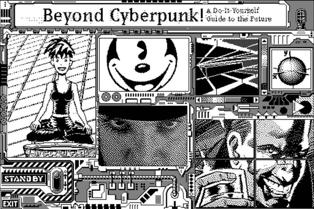
- Beyond Cyberpunk: 1991 Hypercard stack
- BCP web version
- Cyberpunk, by Billy Idol: I like it, I don't care if he's a cheesy little idiot.
- Billy Idol's Cyberpunk Mac app: I can't find an emulator of it, but it's just interactive liner notes and a couple screen savers. Enjoy.
- Archive of Hotwired.com from 1997: Most of the art wasn't saved, it's often broken, but you can get some idea of what it was like.
What I want to note here is the UI in the original BCP and Billy's app. Borders filled with wiring and lights. Knobs and switches. Big chunky click areas. Punk rock, graffiti art. When you click things, audio and animations tell you something happened. Not so much the "Jacking into the Matrix. Into the FUTURE!" clip.
It's much easier to find and read information in the web version, but it's not fun. It's ugly and boring. Like almost everything on the web and apps these days, from Jony IVE-1138's sterile white room prisons where you're tortured for daring to have a personality, to all these endless linkblogs.
There are places with personality, but not many. The web looks like shit. Update: Brutalist Websites has some GeoCities-like aesthetics in a few. Others are sterile voids.
And that's bothering me about this blog. It looks OK, the stolen Midgar art and my '80s neon colors set some kind of tone, but it can be so much more. So in the weeks and months to come, I'm gonna be doing some redesign, make this into something weirder, if not full-on GeoCities. The RSS feed should be uninterrupted, but I'm going to put a lot more resources on the front page.

@mdhughes I agree though find the #indieweb design aesthetic revolves around text as the dominant form of communication in terms of primacy of design...gimme broken css and the repeating stretched out background images of GeoCities any day.
@dgold @eli There's a weird conflation in those. Some are "brutalist" in the minimal, true-to-materials sense. Some are GeoCities punk rock aesthetic, which is where I'm heading.
@dgold I'd also note that the gallery of brutalist sites there seems to stretch their definition of brutalism pretty far.
@dgold re-reading the principles brutalist is probably not the term for my site. I see a lot of folks harping on brutalism on the web, but I also think it has similar (or perhaps complimentary) goals to a lot of the IndieWeb -- so the aesthetic harp, I get, but everything else ?♂️
@eli @mdhughes I’m not sure about the whole Brutalist Web Design concept. I’ve seen some uses of it, and it’s godawful and the clearest statement of principles I could find seems wholly ignored by practitioners.
@mdhughes excited to see what you do! I made a half hearted attempt at some brutalist web design on my site a while back, but think I could push it a bit more while still preserving readability.