TODO App

I'm yet again frustrated by the state of checklist TODO apps. I had a perfect one once, ToDo on the Palm Pilot; aesthetically it was of its time, but for usability on a stylus-based PDA it was perfect. Everything since then has been a compromise.

Must:

  1. Run locally on iPhone and Mac.
  2. Sync automagically, preferably with iCloud and/or Dropbox.
  3. Have multiple lists, though does not need nested folders.
  4. Show a list of items I can check on/off.
  5. Be able to show or hide checked items, delete checked items with a command.
  6. Be able to reorder by hand (or sort with a command).
  7. Start up instantly right back where I was.
  8. Be usable while drunk, stoned, tired, or hungry. UI cannot be a giant pile of fiddly little switches.

Nice to Have:

  1. Due dates/expire dates.
  2. Priority tags.
  3. Search screen to show "What's next?", showing date, priority, list, item in that order.
  4. Notifications. But local notifications require a recent app launch, so you might miss stuff; or interacts with calendar which many people find annoying; or uses push notifications, which costs real money past a small number of users.
  5. Emoji & color tags, photos, long notes, etc.

Must Not:

  1. Give my information to Google, Microsoft, Facebook, or other evil mega-corporation who will weaponize my shopping for killer drones or advertising, or both. I'm dubious of Apple & Amazon, but at worst they seem to be venal, not evil.
  2. Be subscription-based.

Don't Care:

  1. Other platforms. Android, Linux, Windows, I don't use these so they're not a pain point for me. If mulle-objc works out, I could think about that.
  2. Pomodoro, GTD, and other fetishistic rituals.

State of the Field

  • Clear was good on iOS, but it's been "dead"/rebooting at Impending for 2 years already, and they won't be making a new Mac version.
  • Apple's Reminders is awful on the Mac (try finding the "show all" button, and keeping your list in order).
  • Things, Trello, OmniFocus, etc. are too slow & heavy for a grocery list.
  • Text files in Editorial or Drafts don't have usable (finger-sized) checkboxes.
  • Wunderlist got bought by Microsoft and destroyed as per usual. They're getting to be as bad a product graveyard as Yahoo! was.
  • RememberTheMilk is not super useful until you pay $40/year, which is not what a dumb todo list should cost.

What Am I Doing?

Thinking about this. I could write the app I want, release it for $5 on each platform, use Marzipan to make it use the same codebase. In theory, this is pretty easy; I can write a database-backed table view thing in a week. Making it nice is a while longer. Marketing is my least favorite thing, who do I use to get it in front of millions of people?

But I'd have to pay Apple to get back into the sharecropping business, and deal with their shitty Xcode tools and the rotting corpse of developer.apple.com which got fucked over by Apple marketing so you can't get to the FUCKING DOCUMENTATION. @invalidname went to work for them and got sucked into the black hole.

Apple is a Symbol

"If anyone reads this post I'm sure loads of people will tell me that my problems are all my own making and if only I invested in an iPhone all my problems would go away. Well you know what? APPLE IS A SYMBOL OF PRETENTIOUSNESS AND IGNORANCE - YOU DO NOT EVEN KNOW HOW YOUR PHONE WORKS - I DO NOT HAVE TO PAY A TAX TO APPLE TO LISTEN TO MY MUSIC."
Do I really need to get out the soldering-iron again?

Cash, grass, or ass, nobody rides for free.

You can pay the "Apple Tax" for a working system, and as someone who's written low-level audio software: A working system with the lowest-latency, least horrible (not nice, but least horrible) audio APIs in the industry. An iPod touch is still sold with 128GB for $299, which compares favorably to the $500 CD player with 10 seconds of skip protection I had before iPods.

Or, if this is just going to be a home system, how about buying a real stereo system with an amp, and play through that?

Or you can pay with a pile of wiring and an ugly box under a cheap CD player.

Or you can commit to spending the next decade of your life on low-level software and audio hardware trying to make Android audio that doesn't sound like a backfiring Chevy. Nobody else has succeeded, but maybe you'll be the one.

I love these things where someone creates a problem for themselves and then blames THE MAN for it.

Resize Windows with Applescript

So I downloaded it with youtube-dl (after more annoyances with MacPorts updates ) and a helper script ytplaylist: [updated 2019-06-22]

youtube-dl -i --yes-playlist --restrict-filenames --recode-video mp4 -o '%(playlist)s/%(playlist_index)s-%(title)s.%(ext)s' "$1"
osascript -e 'display notification "Youtube playlist downloaded"'

where $1 is the actual playlist URL; "show video list" under the video player or pick from DNA Lounge playlists

Now I have a folder full of properly-named videos. VLC can be opened from the shell with:

~/Applications/VLC.app/Contents/MacOS/VLC jwz_mixtape_200 &

Frustrated by VLC constantly resizing, I then ignored the problem for most of the morning, finally wrote resizeWindow.applescript:

#!/usr/bin/osascript

global appName
global windowX, windowY, windowW, windowH

on run argv
    parseArgs(argv)
    wrapCoords()
    resizeWindow()
end run

on parseArgs(argv)
    set argc to (count of argv)
    if argc ≠ 5 then
        display dialog "Usage: resizeWindow.applescript APPNAME X Y W H"
        error number -128 -- User canceled
    end if
    set appName to item 1 of argv
    set windowX to item 2 of argv as number
    set windowY to item 3 of argv as number
    set windowW to item 4 of argv as number
    set windowH to item 5 of argv as number
end parseArgs

-- Wrap negative coords around to other side
on wrapCoords()
    tell application "Finder"
        set desktopBounds to bounds of window of desktop
    end tell
    if windowX ≥ 0 then
        -- no changes
    else
        set windowX to windowX + (item 3 of desktopBounds) - windowW
    end if
    if windowY ≥ 0 then
        set windowY to windowY + 24 -- menu bar
    else
        set windowY to windowY + (item 4 of desktopBounds) - windowH
    end if
end wrapCoords

on resizeWindow()
    tell application "System Events"
        tell process appName
            set frontWindow to the first window
            set appPos to position of frontWindow
            set appSize to size of frontWindow
            -- display dialog ("front window of " & appName & ": " & (item 1 of appPos) & ", " & (item 2 of appPos) & ", " & (item 1 of appSize) & ", " & (item 2 of appSize))
            -- display dialog (appName & " at " & windowX & ", " & windowY & ", " & windowW & ", " & windowH)
            set size of frontWindow to {windowW, windowH}
            set position of frontWindow to {windowX, windowY}
        end tell
    end tell
end resizeWindow

Now I can just leave it running to update every 5 seconds:

while true; do resizeWindow.applescript VLC 0 -64 720 640; sleep 5; done

Slight annoyance, sometimes it's still expanding the size further down than it should until I size it smaller, and then it works. Fucking software.

I don't know that what I've done is productive in any way, but I have my MTV.

The kids are disco-dancing
They're tired of rock and roll
I try to tell them, "Hey, that drum machine ain't got no soul"
But they don't want to listen, no
They think they've heard it all
They trade those guitars in for drum machines and disco balls
We can't rewind now; we've gone too far
Internet killed the video star
—The Limousines, "Internet Killed the Video Star"

No Aesthetic Sense

You may think "Mark, you're exaggerating when you say:"

In order to run Windows, you need to have a total lack of aesthetic sense, a willingness to put up with "updates" that brick your computer, a tolerance for Microsoft-Quality™ software ("let's add more buttons to a ribbon bar and ship it!"), and a willingness to use junk hardware that consumes twice as much power as needed and makes noise all the time.
me, yesterday

And then immediately an argument broke out on Mastodon where someone (I'll not shame him here) claims aesthetics are unnecessary and ruining the world, artists are frauds, a computer held together with zip-ties is good, and runs better than a pretty, well-built machine (what's EM interference? what's noise? why doesn't Windows wifi work? He does not know.)

These people exist, and are the majority of the customers of Microsoft and other artistically-void software companies.

And I have to point back to Steve Jobs, in 1995, just before NeXT got "acquired" by Apple and immediately took over:

Steve Jobs-1995

The Stubbornness of Windows Users

What we've got here is, a total failure to understand the purpose of the device or the OS.

A somewhat long sidebar here, state of the world in desktop operating systems:

  • Windows: Redmond still ships a garbage toy OS which is the bastard child of VMS and MS-DOS, that costs a lot of money, but runs on cheap (but not sub-$200) computers, many of which come in every shape and size. In order to run Windows, you need to have a total lack of aesthetic sense, a willingness to put up with "updates" that brick your computer, a tolerance for Microsoft-Quality™ software ("let's add more buttons to a ribbon bar and ship it!"), and a willingness to use junk hardware that consumes twice as much power as needed and makes noise all the time.
    Slightly positive, the graphics and sound systems work, and you get all the games; if that's all you're after, though, a PS4 or Xbox OnePlus+Ultra/190 (whatever the name is) is a better deal. You can generally browse the web on Windows, and you'll get some viruses and ransomware but it works. Dev tools on Windows are expensive and shitty, so in order to get real dev work done, Redmond now also ships Linux inside Windows. My bias shows, sure: I've never owned a Microsoft product in my life, and I'd eat broken glass before doing so, but I've had to use them in some workplaces. Dire, but minimally functional.

  • Linux: Distros ship a garbage OS for free that runs on garbage computers, including sub-$200 microcontrollers. In order to run Linux, you need to be masochistic, technically educated, not have any need for desktop apps, sound support, graphics support, games (some Steam stuff now works, sometimes, on higher-end machines!). As a server or microcontroller OS, or a very nerdy dev machine (emacs and C), it's adequate and somewhat supported. Only insane people use Linux as a working desktop. I say that as someone who ran it as a working desktop for a decade, and I loathed it.

  • FreeBSD, OpenBSD, NetBSD: Great server OS's, that ship for free and run on slightly more demanding computers. Only the most technical nerds will even know that these exist. Software, you basically write your own or port from other POSIX systems, which half the time is written for broken Linux APIs and so doesn't work right. On the bright side, they have such limited sound and graphics driver support that if you do have compatible hardware, you'll have working sound and graphics. If Mac OS X didn't exist, I'd be using FreeBSD.

  • Haiku (aka BeOS): Seriously, they shipped a working beta, and it seems nice. Great desktop, graphics and sound support if you're on compatible hardware. Down side, minimal software for it, and if you want to write your own the APIs are in C++. Fuck that, no. But… I do like BeOS, probably tolerable as a nerdy dev computer.

  • Mac OS X (or "tacOS", er, "macOS" as they now style it): The last of the UNIX® workstation OS's, that only runs on expensive devices Apple makes (it's possible to "Hackintosh" a garbage computer to run Mac OS X, but half the services won't work; don't do it unless you're nerdier than a FreeBSD user). Everything actually fucking works. Sound has no latency, and always works. Graphics, aside from low-end devices having a shitty Intel GPU, always works; I'm unhappy with them deprecating OpenGL and going with Metal instead of Vulkan, but Vulkan libraries have been ported. It's fine.
    There are games, Elder Scrolls Online and World of Warcraft in particular, and Steam's full of Mac games. Desktop applications on the Mac are adequate to amazing; there's no "you must use this one shitty program because it's all we've got" like GIMP on Linux. As a dev machine, it's unmatched. I don't touch Xcode unless I have to anymore, but that's what you use to make iOS and Mac apps, and it has some good dev tools like Xcode Server.

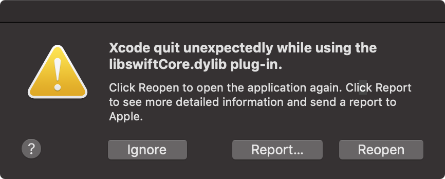
Of course, I say that, and:

libswiftcore-crash Good job, Apple, ship it.

So, end sidebar, the reason you buy Mac hardware is to run Mac OS X, the least bad hardware/software combination available in this horrible century.

What you'd use a Mac Mini for is what you'd use an iMac for, but cheaper and often hidden away:

  • Switch to the Mac from another OS. Steal the keyboard and screen from your garbage computer. You may need some dongles to convert the cables. Learn how to use a Mac. Buy something better when you need it, and re-sell the Mini, which will still be worth 2/3 or more of the original price.

  • Run a multimedia display. Put a playlist of music, photos, or videos on one or a bunch of LCD panels; you can't do this with a Linux microcontroller like Peter suggests, because their graphics and sound don't work worth a fuck. Just try playing a random folder of media on Linux, you'll throw it through the window. It's worth $800 to not fight with Linux.

  • Run a build farm for Xcode Server. Probably need a mid-priced Mini for this, but speed won't matter much because it's an invisible server. It can't be rack-mounted, because not every workplace has a machine room with racks, they just need a little device in some (well-ventilated) cupboard to support the developers.

  • Streaming audio, video, or other server. Put this in a colo farm with a static IP, and deliver whatever media you want. Your podcast and web site has to live somewhere. Now, you can do that with AWS/EC2 and other shared servers, much cheaper, but you don't control the computer, they mostly run Linux (ugh), and often you've written software for the Mac.
    I have an old Mini at colo that runs Minecraft, some file shares, holds backups, used to run Xcode builds but I don't need that now, sometimes runs one-off networking services I want to try out. I may upgrade to a new one, but my needs aren't quite as heavy on it as they were. Invalidstream is currently run from an old Mac pro, but I think he'd be fine on a higher-end Mini now.

  • Literally any other use that doesn't require using it on the move, or extremely heavy CPU or GPU loads. Not a top-of-the-line gaming, Photoshop, or movie editing device by itself, but an external GPU could put it on par with an iMac, maybe even an iMac Pro for some jobs. Probably not a stage DJ device, there they'd use a MacBook Air or even an iPad, but ideal for sticking in an audio booth and doing podcast recording and mixing. Unlike a garbage computer, you can be in the room with a Mini and not be blasted off the air by the overheating fans and clicking drives, and unlike a MacBook it has enough ports.

Most of those tasks require it to be small, quiet, and still attractive if it is visible.

The $799 base model is for only the most minimal uses. For $1,599, you can get:

3.2GHz 6‑core 8th‑generation Intel Core i7 (Turbo Boost up to 4.6GHz)
8GB 2666MHz DDR4
Intel UHD Graphics 630
512GB SSD storage
10 Gigabit Ethernet (Nbase-T Ethernet with support for 1Gb, 2.5Gb, 5Gb, and 10Gb Ethernet using RJ‑45 connector)

That seems like a reasonable Mac workstation, if it had more RAM. +$200 to get 16GB RAM is OK, +$600 to get 32GB RAM is overpriced, +$1400 for 64GB is "bend over and squeal like a pig". You can get 64GB of the same RAM for under $500, and there's a Snazzy Labs RAM Upgrade Tutorial and Teardown; the disassembly doesn't look fun, but worth doing if you're going to use it as a server. A casual user can live on somewhat less RAM with the Apple RAM tax.

lain-s1e3-open navi

Windows and Linux users, people who've only used garbage computers, are confused by Apple's attitude on pricing, upgrades, and repairs because they've never thought about non-garbage computing.

Apple doesn't price based on hardware costs (except for RAM, which they tax 50-300% over cost), but on where it fits in a Portability/Power chart, starting at $1000, because you're buying "machine that runs Mac OS X", not "random collection of parts that does not run Mac OS X". You'll never see Apple micro-adjust prices day to day as part prices or exchange rates change, because it has nothing to do with that.

If you want to upgrade an Apple device, other than RAM in some models, you sell it at a high resale value and buy a better one. Garbage computers are useless in a couple years, cost more to replace parts than they're worth, and have no resale value at all.

If you want to repair an Apple device, it's either free for as long as your AppleCare lasts, or $100 in most cases. Don't keep open containers of liquid on your desk (*), don't abuse your expensive hardware, and the repair isn't a problem (notably, the same guy at Snazzy Labs fucked up his iMac Pro and Apple unsurprisingly told him to go piss up a rope).

*: I wanted to link in the atp.fm episodes where John warns about this, and then gets to say "I told you so", but I can't find them with obvious keywords.

Keychain Access Regression

In OS X before Mojave, Keychain Access had a full Preferences screen, and let you put an icon in the menu bar. Most importantly, from that icon you could Lock Screen instantly and securely.

Well, here's the Preferences now:

keychain_access-mojave

And there's no way to restore this or get equivalent functionality.

I noticed this because the screen saver didn't engage in its hot corner, so went to look for a safe lock, and now… what am I supposed to do?

Goddamn it, Apple. Did you rewrite some shit in Swift and that's why nothing works and security has been job NaN since Leopard?

[Update: As noted by @tewha, There is now a lock screen entry under  menu, where nobody ever looks for anything, and it has a shortcut, which is an improvement. I take back nothing about Keychain Access being wrecked.]

I Miss CoverSutra

My second-favorite Mac app ever (after BBEdit) was CoverSutra — MacWorld review, make sure you have ad-blocking. Alas, it didn't keep Soaps in silks and champagne as she deserved, and she shut down and went to work for Apple.

The key feature here is: It watches iTunes, and shows the cover art with artist/album/track name overlaid or under, small enough to fit in a corner of the screen. So I can unobtrusively see what's playing when I hit shuffle. There were some nice keyboard controls in CS, but I mostly just needed the labelled icon.

I've had some variation on this since the '90s, when xmms would sit in the bottom of my screen, often minimized to a 16x160 or some such tiny bar with track name.

iTunes itself has a "mini-player" with cover art, but it doesn't show the artist/album/track name at all, and it's hard to click on without hitting a forward/reverse button. You can turn on notifications, but then that's annoying, a popup every 3 minutes.

When CS finally broke in Sierra, I switched to TunesArt, which was a mediocre but functional equivalent. When I upgraded to Mojave, TunesArt broke, and the developer is absent.

I have found only two sorta-kinda CoverSutra replacements that are still working. The one I'm currently using is BarTunes (free on Mac App Store), which has a comically flyspeck-sized album preview in the menu bar, and I have to click on it to see the track name; but it seems to work. The flyspeck cover is sometimes identifiable, like Asobi Seksu's Citrus has this unmistakable tangerine cover, but in that case I'm probably familiar enough to not need a hint as to what's playing.

There's also SkipTunes ($2.99 on Mac App Store), which has a desktop preview that apparently doesn't show cover art or track name, so WHY? Haven't bought it yet.

I'd happily pay much more for a working app so I don't have to code this myself.

New Apple Watch

It's surprisingly hard to get a photo of something on your wrist, and you don't wanna see that much arm hair anyway, I get like Bigfoot as the winter approaches. The black-and-Mountain-Dew-yellow Nike+ band is nice and very light and airy, half the weight of the old rubber band, but the M/L strap fits with only one stopper hole left, and I do not have extra-thick wrists; some people aren't going to fit these.

Going into winter when I can wear a watch all the time, it's going to be interesting to get back in the habit. As a physical device, it's still very nice. I'll see how my walk/jogging goes tomorrow.

A lot of the new watch faces have weird "complication" positions, a smiley-face mouth and dot eyes, etc. The old Modular face has dots that no longer work with some apps; Dark Sky just shows an icon and then gives up. After a while now it's shown back up. There's a new Modular Infographic face with a really pretty Earth view, and Dark Sky shows more info in the dot there. But I can't add Nike Run Club to that face, only Apple's dumb Workouts app. So I'm still using the old Modular face and the less-capable dots.

A bunch of apps, Nike Run Club among them, require you to open the watch app, then the iPhone app, so they can set up. There's no other hint in the iPhone app or Apple's "Watch" app that this happens, you just have to know to do it.

The app screen with bubbles you move around but they don't stay where you put them, like a giant round Jenga game, is infuriating. It was a funny experiment on the original Watch, but now it's just stupid or neglectful.

The "artsy" faces are terrible. Kaleidoscope has a few colorful faces but it's like looking at sharp broken glass. Molten metal looks like dripping slime. Breathe is a simple pastel blue "flower" effect.

Motion has the same three butterfly, flower, jellyfish as years ago, Timelapse has the same half-dozen views; not bad, just kind of boring.

The Mickey®/Minnie® faces promote characters nobody cares about, just a corporate logo and mascot of draconian copyright laws. Plus Pixar Toy Story® faces, even more soulless corporate shilling. Where's Daffy Duck (or Bugs Bunny, but I'm more a Daffy)? I had a Snoopy/Woodstock watch as a child, and I'd love that.

It's painfully clear that there's no artists at Apple responsible for picking faces, designing cute iconic imagery, or designing the user experience for this thing, just engineers who all use Modular/Infographic, IVE-1138 who likes molten metal, and corporate lawyers who like Mickey Mouse®.

Get your shit together, Apple.