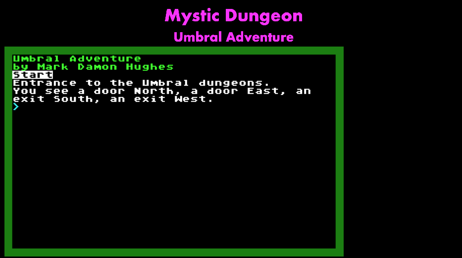
I've finally got my web games/tech demo site MysticDungeon fully running SSL, a proper Node & database server, and all the existing games ported to my common "Learn2JS" framework. High scores and hit counters work for all of them; I haven't set up a really stable migration tool yet but that's on the TODO list before anything more serious gets stored there.
If you run into any bugs, let me know here or on fediverse.
Upcoming will be getting a couple features in PortalWorlds finished, then the rest of the Umbral Adventure world, and some more tools in Grimoire, which will be a tabletop RPG journal/toolkit, more for Referees to use as a virtual screen/notebook than as a coop gaming tool, but you could screen-share it if you needed to. Proper user accounts instead of an unverified screen name will be part of that.
I'm still thinking about if I should replace the old BBS with a forum, or what. Rebuilding the Mystic Dungeon game is on the list, that's part of what the Umbral Atari-like screen is for; nice ATASCII line-drawing characters instead of the few ANSI chars it supported.
Modern videogames suck. Let's go back to the '70s & '80s forever!
Ordered this for my birthday last month, I got screwed (but not charged) by a phony 'zon seller, then reordered. When it got here I discovered it doesn't have an HDMI cable in the box(!!! Some choice language was used that day, I assure you), and I only have micro-HDMI spares, so I had to order one (didn't feel like disassembling my existing systems). So weeks later, I can now set it up!
The "console" is hand-sized (joysticks on the box cover are to scale!), but looks just like the classic VCS, classic fake woodgrain on black plastic, very nice chunky silver switches that feel great when you flick them to set difficulty or choose game mode, smooth plastic where the cartridge slot would be; I think they missed an opportunity to put an SD card slot there. The previous Atari Flashbacks had a less authentic looking case, and goofy yellow plastic buttons.
There's two Atari-style joysticks with it, they have the usual one trigger button, and Home, Start, Select, Rewind buttons on the front base. I'm not in love with the joystick feel, it's much looser than a new Atari joystick which was a real struggle to move more than a few millimeters, these are closer in feel to 3rd party sticks, not as mushy and unresistant as Apple or CoCo joysticks. The device uses a standard Atari 9-pin joystick port, so I'm thinking about either getting old Atari sticks, or if I can find one in good condition the Spectravideo QuickShot which was my weapon of choice in the Atari 8-bit days.
The main screen has menus Favorites, Recently Played, Alphabetical, Atari, Paddle, Settings, About; everything's in Alphabetical, the Atari one is just 1st-party so you miss all the best games. Paddle games are extremely hard to control. Settings are limited to setting a "bezel" design, or wiping your saves. I do wish you could un-favorite games so they don't appear in a normal list, because I have no use for Atari's awful sports games.
So I hit up Yar's Revenge, obviously, and play that first. The first screen has an ugly and inadequate text summary of the manual, it doesn't have scans of the manuals or the comics, so you're going to need to find those; the game variations are not explained beyond 1 or 2 player versions. So on difficulty B (easy in this case; some games used A for easy), game 0 which the actual manual says "the simplest version, a good choice for young children to play. It features a slow Destroyer Missile", I got destroyed the first time, even shot myself with the Zorlon Cannon once, which is maybe the dumbest death I've ever had in a videogame. Second run I killed the first Qotile but got demolished fighting the scrolling shield; in theory it's easier because you can nibble the top or bottom and flee across the top/bottom border to avoid the missile, but timing the gap with the cannon is too much for my distracted old brain. I think some practice will get me back up to speed where I can actually get a decent score.
The Code Mystics iPhone ports of these games do include the manuals, but not all the peripheral material either, and playing on the phone is difficult; I have an "8-bitty" bluetooth joystick that talks to the phone, but BT has perceptible lag, and it's not a big chunky joystick, and then how do you prop up a teeny little phone so you can play a game? No, it's impossible except for the simplest games.
Of course the Swordquest games are unusable without the manuals and comics. I desperately need to find an archive with, say, PDFs of all 2600 game manuals, comics, Atari Force comics, etc. Some of that is in gamesdatabase.org, but not organized for one-click download.
Went thru a bunch more games, and generally they look and play great; as fast as the originals without noticeable lag, tho I haven't done high-speed video recording to verify it's not dropping frames…
Most games have an inset screen with the above-mentioned bezel around it, tho some of Taito's and Activision's games are full-screen. There's no setting for this, and I'm displeased but it's on a 46" or something screen, as opposed to the 17" or smaller CRT of my yout'. There is a fake-scanline setting, which I don't understand the point of. CRTs looked fuzzy so you couldn't really see the scanline, and the pixels were soft and curved into each other, and had color artifacting. On a big LCD, a fake scanline isn't going to make the pixels look softer or change their harsh colors. It's just a completely different appearance. I do have a CRT TV, but only a DVI-to-RGB adapter, I'd have to find an HDMI-to-RGB to drive this.
The paddle games are unplayable with the joysticks; they work, but you can't move fast enough. I killed a bunch of clowns trying to do Circus Atari, and scored no points. I need to order some classic paddles.
Many of my favorite games are in this, but there are some obvious missing ones: Battlezone, Berzerk, Casino, Defender, The Empire Strikes Back, Pac-Man, Pitfall II, Raiders of the Lost Ark. The licensed ones are probably hard to get back; nobody misses E.T.
Several keypad-based games are missing; I'd happily pay for an optional keypad that enabled these: Basic Programming, Brain Games, Star Raiders.
But it does have the Sears Stellar Track which is BASIC Super Star Trek that runs on a dinky little 2600! I have no idea how that was technically possible in 128 bytes of RAM.
Yet another gachapon game based on a classic GameBoy and later Square Enix franchise (SaGa Frontier, etc). To a large extent, this is as basic, standard, zero innovation of a gacha phone game as I've ever seen.
The characters are very pretty, there's some great character art, and then it goes into 16-bit sprite art for the game. Nice retro tone. Repetitive music's getting a little annoying, but it has sliders for BGM, SFX, and voice, unlike so many other games.
Gameplay has a 5-character party, with various formations possible, and turn-based combat, with increasingly powerful skills, multi-character combos, and passives; it's not a real "FIGHT CAST ITEM DODGE FLEE" menu, so all your tactical choices really are in party setup. Right now my main party only has a few melee fighters and one caster, and I just summoned an S rank healer, just need a better AOE caster. I keep trying to use Sif as a main DPS, her stats & damage are amazing… and she dies in every hard fight despite having high HP, I don't know why. I've tried moving her position, giving her best armor, nothing works.
There's a weird distinction in this between characters and "styles" who are the specific instances by rank (A, S, SS, like Lake Woebegone everyone's children are above average, there's no N or lower ranks, no trash chars but A's aren't really useful). You don't gain experience instantly, you have to return to town, hit Dojo, and level up. And increasing level cap/rank is possible, but it costs a lot of gold and "character parts".
There's a shop with random gear and character parts, and will be a forge but I haven't unlocked it yet.
This could be any gacha game—if I really cared, I'd play more Another Eden, Last Cloudia, or get back into DanMachi now there's been new episodes—but it's competently done, I'm having fun grinding these chars up for the moment, and advancing a quest where some Robin-like waif is looking for his sister in "Graves", giant dungeon towers that appear across the land every 300 years.
I don't know if Squenix is going to make any money out of me, there's so far been no paywall where I needed more gems, so it's just a free game.
What I'm Playing: Clubhouse Games: 51 Worldwide Classics
I loved the version on the DS, so I got this the moment it was released on Switch.
You start by picking from a set of little human pieces, which you can recolor their skin & hair, but not their appalling clothes. I almost went with Dad there, but in the end Cool Bro looks better. Looking at the random other players later, I see a lot of them chose that or Suit Guy. As I've noted before, Nintendo has Mii avatars, and then doesn't use them in games even where it'd make sense. You see a little face photo of your Mii in some games, but it should use your Mii in the world! Nintendo is so frustrating and anti-social.
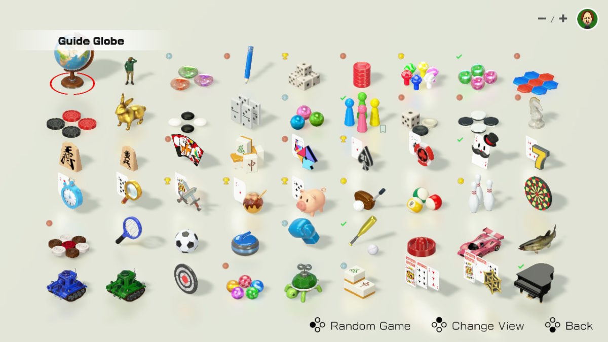
Then you go to a globe UI, with figures representing "guides" that give you a menu of a few games. Or you can just pick any game from a preposterously long line menu, or you can hit X (up button) to switch to a grid which is more reasonable. UX is very confused, always a couple extra button presses or spinning the cursor around a too-large area to get to anywhere you want. You unlock more guides by playing games, earning trophies.
Your piece has up to 5 "recommendations", but you can't set them from in the game, you have to go all the way back out to the globe, find your piece, and add them from a list. And these don't help you jump back to a game fast, you have to find it in the grid every time.
Like almost all Nintendo software now, there's no settings for audio, and the "music" is driving me insane, but I need the sound to play some of these, so I'm constantly muting and unmuting. At least in the old days, Nintendo's music had complete scores, but they've apparently fired all their musicians, this is just beep-doo-beep-de-beep, over and over until I stab someone.
Each game starts with couple figures playing the game with often amusing commentary—the kids narrating Connect Four as a samurai duel is fantastic—often enough tutorial for anyone, but it immediately comes up to a menu with "How to Play" and Play, and hitting + in game usually gets a help menu. They're trying to teach you games you may be unfamiliar with. However, showing the tutorial EVERY time you start a game until you hit X (up) is insipid.
There are medals for winning against the AI and playing at least 2-4 times depending on the game, so there's a little grind possible if you're into that.
Nintendo History guide gives you: Hanafuda, Gomoku, President, Shogi, and Riichi Mahjong, which Nintendo made for a century before going into the videogames business.
Many of the games have local and Internet multiplayer, which I haven't yet tried. I expect the usual Nintendo® Quality™ networking, which is to say everything will drop out constantly. I'd rather play against AIs.
Current playlist of 11 good, 16 bad, 25 unplayed doesn't seem all that positive, but the good games are usually very good, and you can just ignore the stupid ones. The constant terrible music is the only strong negative.
I'll keep updating this post as I play more of them.
★★★★☆
bold is good, italic is bad, plain is I haven't bothered to play it yet.
Mancala: aka Awari. Anyone who's typed in games from Basic Computer Games is intimately familiar with Awari. It's a weird little game, but fast and fun, and there's just enough strategy against a smart player (not the AI) to make it hard to win.
Dots and Boxes: "Boxing" is also very familiar from school. The first player (default to you) is at a severe disadvantage, but it's possible to only give up a few boxes to the second player, and then clean up the rest.
Yacht Dice: aka Yahtzee, Poker Dice. Nice enough, but I found the controls a little finnicky, it should not use the "do stuff" button for both pick and reroll. Slaughtered the AI, as one would expect.
Four in a Row: aka Connect Four. Pretty dull, aside from the tutorial.
Hit and Blow: aka Mastermind, Bagels, etc. with an unfortunate translation name. But I dislike the color-matching version, I'm a numbers person.
Nine Men's Morris: I don't understand this game. You start playing while setting up, and it just screws anyone who loses one piece. Also obviously should have been #9.
Hex: Again, should've been #6. It's a road-building game, dumb low-challenge game.
Checkers
Hare and Hounds
Gomoku
Dominoes
Chinese Checkers: aka Pegboard. Not Chinese, sort of checkers except nothing is captured.
Ludo: aka Parcheesi, Sorry!, Trouble, etc. I switch to the 3 dice to come out rule, rather than automatic/on 6, otherwise it's Parcheesi (not quite Indian Pachesi), a good being-dicks-to-each-other race game.
Backgammon: An ancient dice game, a good fun game. I dislike the joycon controls, cursor-moving by spike around the track instead of selecting individual pieces left/right.
Renegade: aka Othello, Reversi, etc., pretty standard. I lost really badly the first round, and then eked out a win, I've always been bad at this game, or anything that requires me to do deep analysis of simple positions (go, checkers, etc.), I'm a broad strategy for complex positions (wargames) thinker.
Chess: There's a sort of lesson program, but the starter AI is incredibly suicidal, so it's not even interesting. Probably it gets harder, but I'm not that interested yet. I dislike the set design, it's very hard to tell the pawns apart from bishops, queen from king, and there's no alternate set option. Still, it's Chess.
Shogi
Mini Shogi
Hanafuda: Very pretty cards, but I've never learned the sets, and visual association like this is harder for me. AI let me win 3/3 on this, which is crazy since I was just clearing chaff, I never saw more than 2 cards of a good set. However, after winning the guide "gave me a gift" of Mario-themed Hanafuda cards, so that might be easier for me. I think this might be worth practicing at.
Riichi Mahjong
Last Card: aka Uno, Crazy Eights. The card branding is almost but not quite infringing on Uno, so it hits that uncanny valley effect, and I kinda hate looking at it. AI didn't stand a chance, I don't know what they were even doing, picking cards at random? There isn't much strategy to Uno, but no strategy means you lose.
Blackjack: Gives a limited number of rounds, and chips but you can go into debt. Does not have Split, which is kind of amateurish, and it doesn't have the dealer check their down card on A or 10 up, so you might play a round and find out they have Blackjack. It's bizarre beyond belief that they didn't make Blackjack be game #21, but #22. But I can always play a few hands of Blackjack.
Texas Hold 'em: aka Poker.
President: aka Asshole, Daifugo, etc. Kind of an annoying party game, giant hand of cards to manage at start. I hate the rich-get-richer mechanic, which is why it's sometimes called Capitalism, but it's more like Monarchy.
Sevens
Speed
Matching
War:
War, huh!
What is it good for? Absolutely nothin'
Say it again, war, huh!
What is it good for? Absolutely nothin', come on!
—Bruce Springsteen, "War"
I timed this, and it takes 5 seconds and one button-press for each card, and it always resets the cursor to the rightmost card, so it takes a minimum of 2.5 minutes. Was this included as a prank?
Takoyaki: Ten octopus. Almost as random as War, but you get a choice when Joker is drawn, and it's much faster. Winning this nonsense unlocked a Mario-themed card deck!
Pig's Tail: aka Buta no shippo. Instead of a little action game of throwing drawn cards into a pile but avoiding matches, it's a completely random War-like, with a slow "penalty cards" deck.
Golf: Cute little putting game, only has 3 clubs: Driver, Iron, Putter. It's not quite a wacky golf or mini-golf, but it's not any kind of realistic golf simulator.
Billiards
Bowling: Has touch controls or joy-cons, but I have a Switch Lite, so I just went with touch. A little rocky start, but then I can get a strike most throws. IRL, my aim is a little too erratic, but I've played hundreds of hours of Ramp Champ and other touch-stroke games on iPhone, so this isn't hard for me.
Darts
Carrom: Like marbles or pogs, but without the freedom of motion, and a strange "queen" you have to take another coin after or you put it back. I don't know that I like this game, it takes too long and the controls are stupid (stick to move up/down only, L/R to aim?!), but it's competent and kind of interesting.
Toy Tennis
Toy Soccer
Toy Curling
Toy Boxing: Lightly based on Rock'em Sock'em Robots, but without the pop-up heads or movement forward/back, just button-mashing. Controls are A/B to wobble your guy's arms out to hit or up to block, which is implausibly hard to switch between, they should've used L & R shoulder buttons. Normal AI is easy, Hard AI is brutal, I assume the others are unwinnable?
Toy Baseball: Accurately simulates a cheap mechanical baseball game from the '60s, with maybe the worst pitching stick control I've ever seen. Once I got the hang of it, I recovered from 0 runs to 3, while the machine that doesn't fumble with sticks got 6. Not likely to play more. There's no Toy Football, as that's not "worldwide".
Air Hockey
Slot Cars
Fishing
Battle Tanks
Team Tanks
Shooting Gallery
6-Ball Puzzle: A weird collapsing ball Tetris variant, not as interesting as Bejewelled or Tetris.
Sliding Puzzle
Mahjong Solitaire: 20 layouts each for Beginner, Standard, Advanced difficulty. Has a nice color-assist, which is good if you can't easily make out the stack depth. I can see this being a big time-killer for me.
Klondike Solitaire
Spider Solitaire
Bonus: Piano: The piano has a single octave, the help says the buttons or shaking joycons does something, but it does nothing on the Switch Lite at least. Turning the device upside down gets you a synth with 4 octaves selectable by button, but the keys don't rotate into normal position, so it's pretty unusable. I would prefer a real "toy piano" simulator, but then you may as well buy a teaching piano toy or a proper cheap synth, they're $30 or less on the 'zon.
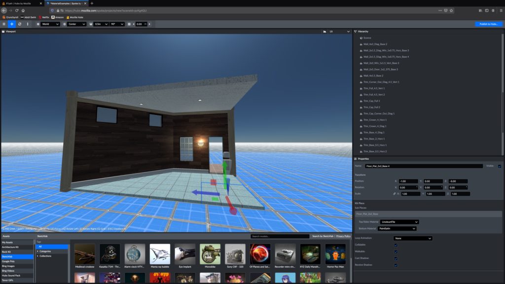
This time I did the tutorial for Spoke—which you should absolutely sit thru, and try out as you go—and then made a scene based on the Material Test. Well, first I tried to edit the cafe, but it turns out that's a single model with 80K polys, not editable. Pity.
So you can make a scene by adding items from a library, Architecture Kit has most of the building blocks you'd want, mostly in 1x1 to 4x4m segments, and a small palette of industrial textures.
Google Poly and Sketchfab have hundreds/thousands of items to drop in.
Unfortunately, while you can upload your own textures, you can't put them on any object, they're just images. The best I've found for now is to just lay it down like a carpet, 0.01 above a flat surface so there's no z-fighting. Works but obviously stupid. The actual workflow is apparently to clone ArchitectureKit, edit it in Blender (oh fuck), upload.
Not a bad toybox, not as good as Second Life, Garry's Mod, or Unity, but usable, and a lot cheaper (paying SL $1 per 25 images sucked giant balls until later I made it back 1000x by selling things and coding services).
The Spoke controls continue to be awkward, and often contradictory to Hub's, but I got used to them.
There doesn't seem to be any way to select or group multiple objects and apply changes to all of them, except translation, rotation, etc.; texture remapping is kind of a pain. And there's no texture offset field, so if your objects aren't full-sized and don't line up exactly, you can't make them fit. Don't use hex or tile patterns on such objects, I guess, or hide the seams under carpets.
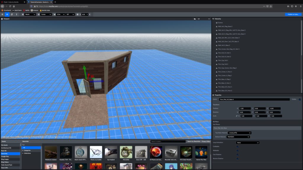
After a bit of work, mostly changing textures but adding some trim, adding a doorknob, fixing misaligned blocks, I got a slightly better version of their demo, hit Cmd-S to save (in Spoke), then Publish to Hub. Which takes >1 minute for a tiny default scene.
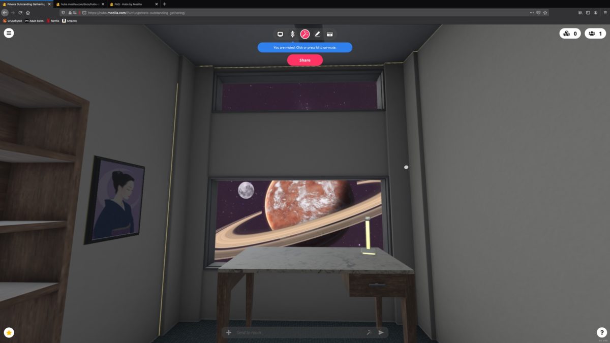
So starting over from the watery caldera template, and a "forest" model from Poly, I'm building up a dark twilight castle, we'll see how that goes.
Mozilla Hubs is a VR/3D chat room, sort of like IMVU, Second Life, etc, except semi-private instances. That should be quite interesting. It doesn't need a client, it uses the browser, so I opened it in Firefox, assuming they're favoring their own. Whoo, listen to those computer fans, this thing runs hot, to get me 30-45 FPS (admittedly on a 5K iMac…)
It uses a horrible no-password email-link token login flow. Almost just stopped right there. I have a password manager, I'm fine with entering long passwords; I don't like opening email every time I come to a site.
Picking name and avatar seems persistent, but the avatar choices are either box-headed robots, round-headed robots, or super creepy human busts on floating buttplugs. I did eventually find a Bender avatar, so that's sorted for now.
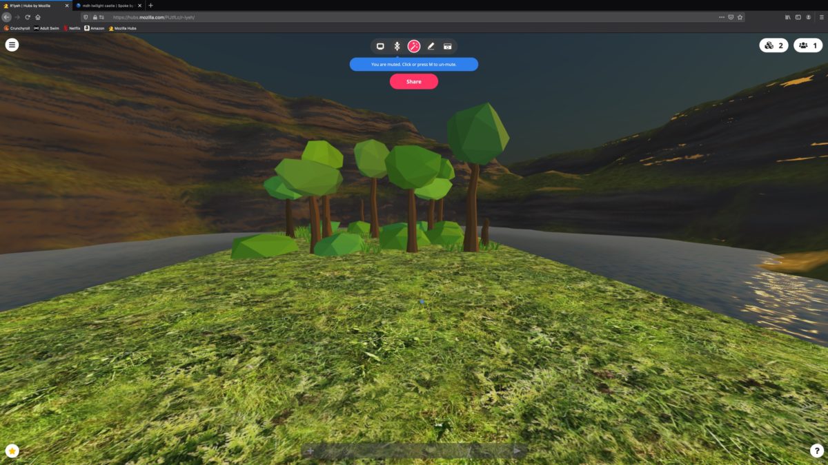
You start in a tutorial on a terrible little "River Island" with painted-on water. It took me a while to realize you can create and edit objects you place, but the "stuff" in the room is created in a world editor and you can't edit those while you're in the scene. Nothing can really be interacted with, you can't sit, but it doesn't matter because you don't have a moving body to animate. 1990 called and wants its VR back.
Controls are weird. It does WASD, but Q/E rotate you by 45° per tap, left-mouse drag turns you, right-mouse drag sets a destination, which is backwards from every MMO & FPS. Shift sprints, which annoys me since Minecraft has shift=crouch, ctrl=sprint, but whatever. Flight is G or /fly in chat, to go into no-clip flying mode, which can be disabled by the room's owner. Tab or space open a GIANT emote bar, which is frustrating since holding space is also how you edit items. I have to back way up to see the popup menu over the giant emote bar.
Hamburger menu, Change Scene lets you pick from quite a lot of worlds. Some you can bookmark/copy to "My Scenes", some you can't, and I don't know why. The scene list doesn't keep your place, each time you open it, you start at page 0 (actually, all pages say "0"; so you're just paging forever with no idea where you are).
Scenes I've liked so far:
morning dew: Nice open café.
Atmosphere Lounge: Cool cathedral floating in the void, but can't bookmark it.
Viewing Room: Nice little basement room with sofa.
Wizard's Library: World of Warcraft-y cute tower with two levels and little nooks.
Mad Scientist House: Rick & Morty's house. Not every room is detailed, but the doors are pass-thru.
TheNightClub: Dark hallway, dance floor, and stage. Tastefully black and purple. Seems useful.
But many others are weird models with no interiors, and almost no place you can walk. I've seen one scene so far that had sound effects, so it's possible, just nobody else bothered.
I'll probably go back in and try making a scene, and then make it permanent(?) and see how the user interaction is. I'm not expecting much given these terrible avatars, but world-building is fun.
Now, that's just their VR headset, which is an extremely low-volume, 1% of the market gadget; VR's kind of awful in practice, but it keeps being "useful next year" for the last 40 years, and someday it'll be right. Steam as it is, >50% of the games I look at have a Mac version; it's not dead yet, but it definitely smells bad.
I blame Apple and their terrible support for gaming, in fact overtly hostile attitude. They like the PR opps at WWDC, and they like taking 30% gross profit of gachapon/IAP ripoff games made by Chinese clone factories, but never do anything after that, never provide game dev support on the platform, or put gamer GPUs in common hardware. They do not hire gamers or game developers, and they fired all the engineers in upper management, so it's just sales weasels left. And then killing 32-bit app support in Catalina just put a knife in any classic gaming.
The Mac used to be fun, a great desktop UNIX workstation which could also run a fair amount of games. Now, nothing works.
Elder Scrolls Online on the Mac is a pain in the ass these days, about half the updates make your camera spin out of control because ZOS doesn't have a Mac developer or any testing, either, they just rely on a cross-compiled build and push it out.
The suggestion to use Windows Boot Camp is just a giant middle finger, but what else are you gonna do?
Well. Given my plan to switch my workstation to FreeBSD when Mojave is EOL, I may accelerate that to this year, and have a partition for Windows just to play games. Which is stupid, but there you go, this is the dumbest, worst decade already just 4 months in, so why wouldn't computing be as bad as everything else?
Certainly anyone who uses Windows to try to do anything productive is… well, more masochistic than I am. It's just unbelievably awful and un-designed. I have a VirtualBox of it that I use for some testing, and it's like a 10-year-old read about CP/M, windowing systems, and bad middle management systems like stack ranking, coded it in BASIC and C, and then billions of dollars of business software and games were run on it. No part of that is a good idea.
Linux is so unbelievably awful; it's a half-assed server or embedded system, but not engineered for safety and reliability like a real UNIX workstation, the desktop is even more amateurish, and "business software" for it is comically bad. I'm not going to do that for a few half-working games.
But here we are. If I want to play games other than Animal Crossing, I suck it up and run a garbage OS as a partition.
Finally got my town rating up to ★★★☆☆, K.K. Slider to visit, and unlock terraforming! \o/, so I've been digging all day:
Before:
After:
Not a huge visible difference, the basic layout was nearly perfect (I would've preferred a mirror image where my mountain estate was on SW corner instead of SE, but I'm fine with it; it's the same layout as my Wild World village), but I moved the river course up against town hall to make a lot more space, added chokepoints (marked with path dots visible on the map) where I can jump across rivers, I'm still thinking about a couple more chokepoints or maybe river stepping stones?. Put a secret passage (covered in paths so nothing'll grow there) out to the north beach where Redd's ship pulls up. The temptation exists to build complex mazes, wipe out all the random character of the island, but so far I'm resisting. A dungeon hidden behind a mountain might be fun, though.
One frustration of this is, you can't change beachfront or the big rocks. I have some very inconvenient rocks in my east beachfront; pulling the cliffs back a couple blocks helped, but it's still not a straight run.
Another is, the entire user interface for building is "press A to do stuff". What stuff happens depends on whether you're 1 pixel forward or back of a grid border. Maybe you'll build up, maybe you'll rip down and create a slope, maybe you'll lower the block. You can't tell until you do it, and there's no grid lines, laser pointer, or undo. There's 14 in-game buttons and 2 joysticks Nintendo could've used to put each function on its own button, but they didn't. Of course, the rest of the interface is Nintendo Awkward, so why wouldn't this be? But it's a long sight from Minecraft (Java edition) where you can instantly hit 1-9 for items/tools, left click to hit, right click to build/place. Maybe they think the target market only knows Minecraft (Pocket edition) which has equally shitty controls, so being usable isn't necessary?
Playing the stalk market (buying and selling turnips) requires a little accounting, so I made a spreadsheet:
Which I've brought up many of these before, but Proteus, Dear Esther, and Bernband especially, everyone should play. I've played and enjoyed most of Connor Sherlock's sims, but they're ~50% half-broken and all very similar to each other; but still great art pieces you can explore.
After 2 weeks of delay, my Switch Lite finally shipped. I should've got it earlier, I know, but there was nothing else I wanted.
The device is bigger than I expected, not easily pocketable (unless you wear a ScottEVest windbreaker with giant cargo pockets like I do), the screen's nice, the sticks are a little stiff and the D-pad's very stiff, but all those will loosen with use. Good but not best Nintendo quality hardware. Power brick is awkward, I ended up having to put it on an extension cord from my power strip. I haven't stress-tested battery life, but 1 hour of Animal Crossing = 10-15%, which means I need a recharge whenever I'm not using it.
There's no security to the device, AFAICT: I would like it to require a PIN to start, but instead it just makes you tap A three times and then anyone can play with it. At least I have my password on anything in the shop, but do not let anyone have physical access to your Switch!
I'm unpleased with the Switch UI, but that's true of most consoles. Half the time it's easier to tap on the screen than try to use the buttons to do anything. The main UI is fairly annoying: A single bar of games, sorted in order you last played. No way to pin "favorites" at the front. There's plenty of room to have a 2-high grid, but they don't. There's nothing like the Wii Weather & News apps, alas. Nintendo keeps having good ideas then giving up on them.
Note: I'm going to abbreviate all the Animal Crossing games: ACWW (Wild World, on the DS), ACPC (Pocket Camp, the mobile game), ACNH (New Horizons, on the Switch).
I did a digital purchase for ACNH, and it took a while to install but it's a straightforward process. And I got 300 "gold" on the eShop, which I used to buy Tetris, NES, SNES, a jigsaw puzzle, and a mini golf game, just to have something else in my game bar. The only other thing I'm really interested in is the new Clubhouse Games, coming in June. I have the old one on the DS, and it was a great pack of minigames, I'm expecting the new one to be even better.
So finally ACNH finishes downloading.
The avatar is still not a full Mii. I don't understand this; Nintendo has a perfectly nice, universal avatar-creation system. You can use it all over the UI. You can't use it in the damned games, you have to pick from a handful of potato-looking faces on a single head. My aquiline nose is reduced to a flat triangle. No beard. The only long hair either has bangs, or is wavy; so I went with that. It's better than earlier Animal Crossing games which lock you down to male or female, tiny set of very conservative Japanese hairdos, facial features chosen at random, but it's not good. Not every game has to be Second Life or Elder Scrolls with 100 sliders for lip twitch and eyebrow fluffiness, but the Mii editor is RIGHT THERE. LOUDEST DRAMATIC SIGH POSSIBLE.
I pick my island layout, which cuts off the north and east just like my old ACWW island, and name it the same, Yama (technically Naraka is more accurately the Buddhist underworld, but I prefer the shorter name of the lord of the dead; I've done the Kami/Yama thing in my videogame names for 35-40 years now). The downside of my layout is early game I only have 1/3 of the island accessible, until I get a vaulting pole, which hasn't happened on day one/night one. But later, I'll have splendid isolation for my base in the SE peninsula, put all the villagers & services in the noisy SW area, and my groves up in the north.
The buttons are never fully explained, at least not in the digital version:
L stick: Move
R stick: Shift camera up/down, left/right does nothing
A: Action, Hold in inventory to drag items
B: Cancel in menus, Run while moving
X: Inventory
Y: Take Item
D-Up: Unequip
D-Left: Prev Tool
D-Right: Next Tool
D-Down: Unequip
+: Confirm
-: Save & Quit
Left: —
Left Lower (LZ): Nookphone
Right: Chat
Right Lower (RZ): Reactions (unlocked later)
O: Camera
Home: Quit
If you were playing ACPC, then once you've linked your account, you can get access to a special store from the Nook terminal of several ACPC items. Linking instructions. I've so far only bought the Campsite sign and Market Square flags, but I might just get everything once I have the bells. ACPC also gets 50 leaf tickets, but I've quit cold turkey a couple weeks ago, it's over. Nintendo sent out a survey which basically asked if you were ever going to play ACPC again, and I said no. This is a little unfair, in that ACPC is a slightly entertaining Animal Crossing-themed game, it's not terrible, but it's not as good as having your own unique island, and all the furniture and clothing you can only get for paid currency leaf tickets in ACPC is annoying.
My starting animal friends are Diva (purple, elegant frog) and Lyman (green koala); Diva's OK, she was a regular in my campsite in ACPC, I don't know Lyman but he's been friendly and not too stupid. I know they've lightened up a lot of the animal personalities from the old games, so I keep expecting cruelty or idiocy and they don't do it. Still, I'm pining for some of my favorites like Bunnie, Fauna, Cherry, Tex, or even dumb jock Jay, I wish we got some choices here.
The Nook shop/Resident Services is your main HQ for a while. You need to turn in fish and bugs to Tom Nook until he calls Blathers over. Then you can sell everything, or stack it up outside your house to wait for the museum…
Timmy Nook buys and sells items; one thing I didn't realize early on was you can hit R on the buy list, and go from some crappy furniture (an oil drum and a water cooler, in my case) to a screen full of tools! Including the slingshot! I saw a balloon with a present first day and couldn't get it because I didn't have the slingshot yet! He also has several recipes, flower seeds, medicine, and such. That should be the front screen of this shop. I'm so mad at this UI now.
The "DIY For Beginners" recipe pack he sells includes Hay Bed, Stone Stool, Old-Fashioned Washtub, Frying Pan, Wooden-Block Toy, and Ocarina. To get into any furniture like the stool, you just walk into them, and can then rotate around with the stick. It takes a little getting used to, but my campsite's coming along; tho I'll have to move it soon.
Tommy Nook is useless so far, he tries to give advice but it's all pretty obvious.
Fishing is much easier than ACWW, not as trivial as ACPC. There's some aiming and luring skill needed, but not much. You can't apparently scare them off easily. Bug catching is about the same as ACWW, but you can't scare the bugs off as easily either; ACPC was savage in that, you'd walk by a bug you wanted and it'd vanish. Catching my first tarantula was a bit of a Most Dangerous Game hunt, but it didn't get me. The damned wasps got me twice on the first day, but then Diva gave me the Medicine recipe, so I won't have to pay for the stuff at least.
Crafting starts out with very limited recipes, nothing like the Minecraft grid where everything is possible if you have the materials. But turn in a few fish & bugs to Nook, talk to the animal friends, find bottles on the coast, or shake trees, and you'll find more.
Getting materials can be a little tricky at first. For instance, trees drop one branch on first shake, then often none for a few shakes, THEN they drop up to 9 more. So I spent one loop around the island getting only one branch per tree…
Inventory management is a serious pain, you can't move items between slots like Wild World, you have to drop items, then pick them up in the order you want. Every time I break a flimsy tool, I'm back to sorting inventory out. You also can't split stacks, except one at a time; if you want to keep 50 weeds but sell the rest, pound sand.
Of course Animal Crossing follows real time. You can lie about your time zone or change hemisphere, or "time travel" by screwing with the Switch's clock, but I'm not going to do that. Today is today. With my night/day schedule, I can see morning daylight when I'm about to hit the sack and do my final play of the day, and my wake-up/grind part of the day will mostly be at night, which works fine. Just make sure I keep a net ready at all times to catch tarantulas, because Animal Crossing tries to kill night owls.
I'll get my friend code tomorrow and post it in the next update, and in my About page.
To get photos off the Switch is kind of a pain in the ass. You can transfer them to microSD, do a hard shutdown (hold down "power" 10 seconds), move the SD to your computer, extract, put it back, power back on. UGH. Or spam them 4 at a time to Twitter or Fuckbook, so my post-syndication-only Twitter is now posting ACNH screenshots irregularly, enjoy.